Charles Rennie Mackintosh~ Born June 7, 1868

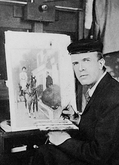
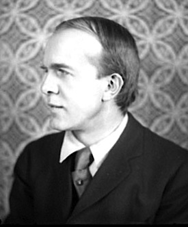
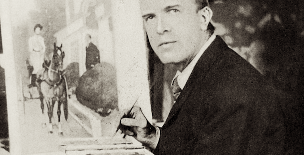
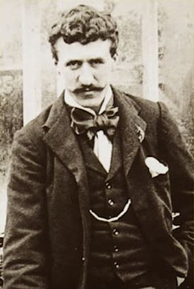
Charles Rennie Mackintosh (7 June 1868-10 December 1928) “was a Scottish architect, designer, water colourist and artist. He was a designer in the Post-Impressionist movement and also the main representative of Art Nouveau in the United Kingdom. He had considerable influence on European design. He was born in Glasgow…”
FROM https://alchetron.com/Charles-Rennie-Mackintosh-1221200-W

“Mackintosh was apprenticed to a local architect John Hutchison, but in 1889 he transferred to the larger, more established city practice of Honeyman and Keppie.

To complement his architectural apprenticeship, Mackintosh enrolled for evening classes at the Glasgow School of Art where he pursued various drawing programmes.”
FROM https://www.crmsociety.com/about-mackintosh/charles-rennie-mackintosh/

“The majority of Mackintosh’s architectural practice was supported by his wife Margaret Macdonald with whom he had studied at the Glasgow School of Art. Her mind was often responsible for the artistic flourish that became so integral to the aforementioned Mackintosh Rose motif. In his time as a professional architect, Mackintosh worked with his wife to design buildings ranging in use from residential, to commercial and religious.”
FROM https://www.archdaily.com/639483/spotlight-charles-rennie-mackintosh

“Despite success in Europe and the support of clients such as Blackie and Cranston, Mackintosh’s work met with considerable indifference at home and his career soon declined. Few private clients were sufficiently sympathetic to want his ‘total design’ of house and interior.

A move to the South of France in 1923 signalled the end of Mackintosh’s three-dimensional career and the last years of his life were spent painting. He died in London on 10 December 1928.”
FROM https://gsaarchives.net/collections/charles-rennie-mackintosh/

Design Museum~ https://designmuseum.org/designers/charles-rennie-mackintosh#toggle-submenu
Charles Rennie Mackintosh Society~ https://www.crmsociety.com/


Edward Penfield: Born June 2, 1866

epportraitBicycleCatseptoo

“What many do not realize is that Penfield’s Harpers years account for less than a third of his thirty-four year career. During the decade after his self-retirement from Harper and Brothers, his freelance work was seen by millions of people on hundreds of magazine covers and advertisements.

Not a boisterous self-promoter like some of his contemporaries — he rarely gave personal interviews — Penfield preferred to live a quiet life near his ancestral stomping grounds in New York. But at the same time he was considered “that rare person among artists, an active citizen.” He volunteered for civic duties, spoke at womens’ clubs, taught at the Art Students’s League and served as president of the Society of Illustrators.

More than a poster artist, Edward Penfield was an illustrator, art editor, graphic designer, writer, painter, educator and mentor — an American Master.” FROM https://edwardpenfield.com/introduction/

Google Arts: https://artsandculture.google.com/entity/edward-penfield/m09rt2r_?categoryId=artist&hl=en
Edward Penfield posters~ https://digitalcollections.nypl.org/collections/posters-by-edward-penfield#/?tab=about
eptopper

Jan Tschichold: Born April 2, 1902


TSCHICHOLD, JAN 1963 © ERLING MANDELMANNBy 1945, Tschichold had gained fame in the typographic world for the books he designed, as well as those he wrote, altogether an impressive list. His beautiful work and impeccable craftsmanship made him the logical choice when Allen Lane wanted somebody to develop an orderly system of design for his Penguin Books.


Tschichold combined a series of grids with a set of rules of composition and forced their acceptance by a reluctant, sometimes rebellious, printing craft. His perseverance served to inspire tremendous improvement in the quality of all British books, as his techniques were admired and imitated.

FROM https://www.oneclub.org/adc-hall-of-fame/-bio/jan-tschichold

http://www.theguardian.com/artanddesign/2008/dec/05/jan-tschichold-typography
http://www.theguardian.com/culture/gallery/2008/dec/05/design

The White Album Cover

Richard Hamilton* discusses designing the White Album

In one of Richard Hamilton’s last filmed interviews, he tells the story of how he designed the Beatles White Album cover

The Beatles record label, EMI had concerns, but Paul McCartney, who commissioned Richard Hamilton to design the cover, persuaded EMI to allow the design to go ahead. Together with Paul McCartney, they decided that the next Beatles cover should be the total opposite of the Sgt. Pepper’s design…

White Album


*Richard Hamilton (February 24, 1922 – September 13, 2011) was an English painter and collage artist.


The White Album: How Richard Hamilton Brought Conceptual Art to the Beatles
https://www.sothebys.com/en/articles/the-white-album-how-richard-hamilton-brought-conceptual-art-to-the-beatles

Rea Irvin & The New Yorker

TNY
The New Yorker
debuted on February 21, 1925 — and its cover was graced with the first of many appearances by the magazine’s mascot Eustace Tilley. The illustration was by Rea Irvin (1881-1972), the man responsible for the eternal look of The New Yorker right down to designing the logo typeface, named “Irvin” for its creator.

Font

Irvin

In 1924, Irvin joined an advisory board to help launch The New Yorker. For the cover of the magazine’s debut issue the next year, Irvin created Eustace Tilley, a smartly attired dandy with a monocle and top hat. This amusing and worldly, yet somewhat detached, character embodied the spirit of the new publication. Tilley quickly became Irvin’s signature piece and has reappeared on the magazine’s cover every year since, with one exception–1994.

Between 1925 and 1958, Irvin’s work appeared on 169 covers of The New Yorker. Hundreds of other illustrations by Irvin were also published inside the magazine. http://www.tfaoi.com/aa/1aa/1aa398.htm (dead link)

https://en.wikipedia.org/wiki/Rea_Irvin
https://www.newyorker.com/magazine/1996/01/22/rea-irvin

Irvin had been art editor at Life, and Ross trusted
his taste, which—as others have noted—in turn shaped his
own. Ross biographer Dale Kramer describes his influence: “[Irvin]
had a quick, accurate eye for good craftsmanship. More important, he
knew what changes were necessary to make mediocre work passable and
passable work better.” Born in San Francisco, Irvin had worked as
a newspaper illustrator, stage and screen actor, comic strip artist, and
piano player before arriving at Life. Irvin’s diversity of
aesthetic experience was as essential to his invention of The New
Yorker’s visual style as Ross’s vagabond generalism was

to his conception of the subject matter. http://www.printmag.com/article/everybody_loves_rea_irvin/
Evolution illustration

‘What Every Young Designer Should Know, From Legendary Apple Designer Susan Kare”

If you’re reading this on a computer, you owe a debt to Susan Kare, the pioneering designer behind the original Macintosh’s icons and the first digital typefaces like Chicago, which proved that computers could have great fonts. The 60-year-old is a legend in the digital design field, but you’d never guess it from talking to her. In person, Kare is breezy and down-to-earth, just as happy to chat about how much she likes Lego, or which celebrity gossip blogs she reads, as she is about her early days at Apple. After she chatted with us about her recreation of Apple’s original Pirates of Silicon Valley flag, Kare shared with us some words of wisdom for young designers hoping to make as big of an impact as she did: fake it until you make it, and remember that what makes design great never changes.

A version of this article appeared in the February 2015 issue of Fast Company magazine.

http://www.fastcodesign.com/3038976/what-every-young-designer-should-know-from-legendary-apple-designer-susan-kare